12.14.2010

Book o' Death WIP

Angel of Death's Book o' Death. That comic will happen eventually. Just a little something I've been poking at between work, class, sleep, and finals.

12.06.2010

RhinoScorp

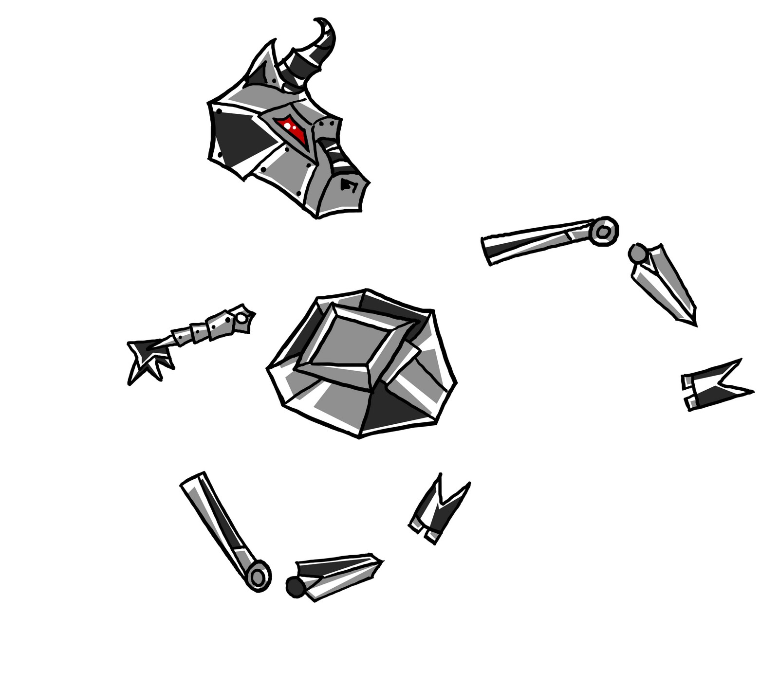
Wow, it's been a lot time since I've posted. I've been super busy with visiting people for the holidays, and then coming back and being absolutely engulfed by the end of the semester -- I've been working on art stuff, but, unfortunately, basically all of it has been stuff for classes or gifts for people. So! I decided I should sketch this nonsense that my sister and her boyfriend helped me come up with, instead of work on the pointillism that I will eventually post here. I have to say, it was a lot of fun, and I'm a fan.
Took me a little over an hour. I'm a slow worker, but I'm getting there!

I kind of love how inquisitive she looks, with her tilted head, and her pincher out and aloft, as if she's about to press some button that will explode everything.

...it's the final week. Forgive me my nonsense.

11.19.2010

Cower - Milk Bottle

One more concept to go, robot Cowers! ...I sort of want to do robot cow-centaurs, because that's so mixed up. But then they wouldn't exactly go with the top-down views since those depict the Cowers as more anthropomorphized and more like bipedal cows -- but I think it's okay, because the are icons for something more detailed and specific...right? It's late and I'm trying really hard to be able to draw these robot cow-centaurs. Which is exactly what I'm going to do. 

11.17.2010

Cower - Alien Bull (from hell?)

Two concepts to go! Again with the red eyes -- thus, evil.

11.02.2010

Cower - Robot Cower

Red eyes signify teh evil, always. That's how you know this cower is the enemy.

10.31.2010

Cower - Mad Alien Cow

If this is a "mad (alien) cow," does that mean by definition she's a she? I mean, cow is the female term.

More Geeq stuff! I think that puts me a little over halfway done with the in-game characters! Then I just have to do concepts. That seems backwards. Oh, well.

Also, that puts me at 10 posts for October, meaning I reached my goal! Eat that, October! Even though I sort of cheated. I don't care. I made the goal.

10.28.2010

Digital Portraits


More digital life drawing stuffs. I believe these were twenty to thirty minute poses.

Digital Gestures

I brought my laptop and tablet into my life drawing class -- t'was fun! And definitely interesting. I think it's helping me learn to sketch on the computer and gain more of the control I have with paper. I'll have to try this more often.

Cower - Bird's Eye View

I haven't updated in forever. I've been so busy, that I actually forgot to update, even though I've been drawing. Which is ridiculous, because this is usually my favorite part of the drawing process.

Cower and enemies for the in-game designs. A milk bottle, tick/blood-sucker/face-eater thing, and one of the cowers.


10.19.2010

Mama Dairy


Super quick update before I hav to run to class. Just doing top-down views for the characters now. I'm not sure if this one is too confusing -- you don't get a very good sense what Mama Dairy looks like, but I don't know if that's really possible with this view. I'm also not sure as to the level of detail that should be going into these, because if there's too much and the images are too tiny, that will confuse things even more. I'm going to work with the colors and darks versus brights to make the legs more separate from the arms and "head," to help clarify Mama Dairy.

10.16.2010

Cowers - Momma Dairy, ver. 2

Not completely happy with this. I'm going to go back and rework it when I draw the second Momma Dairy pose where they look more alienish.

10.14.2010

Akateko

Japanese folktales are the stuff of horror movies and nightmares -- so, of course, I hopped on that bandwagon. Here's one such inspired concept sketch! A super quick one. I want to flesh this out. It's such a great-creepy thing.

10.13.2010

Fae designs

Just playing with different creature designs. I really need to do more creature and object (and environment...and possibly some character, too). Being very inspired by folklore and mythology. Japanese folklore is decidedly awesome. And horrific. That coming soon.

10.11.2010

Sewers

Wow, I haven't updated in awhile. What is this? I need to get to drawing more. School and work are distracting me away from all the stuff I really care about! This can't be. I want to have at least ten updates in October. That's a fairly lofty goal for me. So, bring it, October!

Texture/environment sketch

Breakthroughs, whoo! I'm figuring out how to draw these more quickly, I think. Finally. I've been trying to do that for over a solid year. Progress is so relieving. And rewarding.
Just another piece for my digital art class.

9.29.2010

Cowers, 2nd

Second design of the cowers! These are (as you can see) bipedal and much less realistic. I couldn't really wrap my head around a realistic, bipedal cow that looked cool, so I went in a different direction with it. Also, there is no way to make udders look anything other than really strange when attached to a bipedal cowgirl. Lesson learned. I did my best.

9.23.2010

Underdark

I never can tell if (especially environment pieces) are too dark when I'm drawing on my computer. I usually draw with my brightness as low as can be (so that my eyes can hang in there longer), but then when I turn the brightness up to look at the picture, it looks super washed out. That usually leads me to messing with settings. Hopefully this looks decent on other people's computers.

Inspiration drawn from its titlesake, part of a piece for my digital drawing class.

9.22.2010

Pretty in Pink?

Rough color sketch of the Momma Dairy design I posted a few days ago. I'm happier with the form on the left, though I still like the lungs/ribcage of the parasol thing. I'm still working with this. Also, it might be too grotesque for what they're looking for. We'll see!

Don't know how I feel about her coloring, may go back and change it. I can't decide if it's playing into the whole all-women-must-love/wear-pink-always, or if its subverting that because Momma Dairy isn't a woman, because it's an alien, and is super unfeminine, for the most part....I don't know. I felt like pink went with the dress, and then was interesting because it's so not cute/is grotesque in its actual form. Must think on this! But first, must sleep.

9.19.2010

More Cowers.

Just wanted to rough in some colors and see how they'd look. This is more what I imagined -- tried to space-ify them a little, as well. but I'll definitely need to work on that more if we go with this version. Onto Momma Dairy's design! While I think of how to draw anthropomorphic cows, for the other design of the cowkids...hm.

9.17.2010

Momma Dairy

More Geeq sketches. Very quick sketch for ideas, I'll go back and add colors to both of these so I can get a better idea for the design and style. Basically, I want Dairy to look humanoid at first glance, but at closer inspection see that the dress is made out of hundreds of thin tentacle/leg things, that move slowly, like a dress in a breeze, but that is what causes her to move; see that the parasol is actually coming out of her back/spine, and moves slowly in and out as she breathes (underneath the ribcage-parasol would be four pairs of lungs -- though I'm not sure I'd want these to be human-looking, because she isn't supposed to be human...then again, if they aren't human looking, how does one know they're lungs? Aliens are confusing). And other things. I think her general head-structure is too humanoid, even though she only has a mouth on the part of it that can be usually seen, and her eyes or other senses are elsewhere, possibly amongst the parasol. Need to think out things -- until then, I'll just keep drawing. She maybe looks a little more creepy/grotesque than she was supposed to -- but what can I do, she's an alien!

9.15.2010

Cower

Awesome news! I'm doing some concept art for GeeQ Studios, an indie game company. The game that is currently in production is Cower, which you can read about on the website. These're just a couple of quick sketches for the Cow Boys and Cow Girls. Just a thought I had, and I don't know if the team will be inclined towards this direction, but I thought it was interesting. These're a couple of the Cow(Kids?) prior to the invasion. She's with child because -- well, Momma Dairy's milk has to come from somewhere, right? Where does a cow-centaur carry a child anyway? In the cow-stomach? But then is the human-stomach completely flat? In my version, the human-stomach carries the child until a certain point, and then the cow-stomach does after that. How does this transfer occur? I have no idea. I'm no expert in cow-centaur anatomy. Figure it out yourself. Also, they aren't nearly space-y enough. Apparently I ignored that little detail when coming up with this idea. That'll be revised if they like this version! Wow, this is a long post. I'm done now. I blame it on the sleepy state I currently find myself in.

9.14.2010

After much ado (and todo)...

Resingular is launched! That's right. So much for all those promised updates. However, I'm going to force myself to fill up those pages with images, so I will (time allowing) be flooding this blog. Possibly for real this time.

8.29.2010

Website Layout - Scarab Final

....I think.

I'm pretty sure. Anyway, that ends the ridiculous flood of website-related posts. Back to studies and sketches and -real- designs, thank everything. Well, as soon as I actually make this work in Dreamweaver, that is.

8.28.2010

Website Layout - Scarab 1.5

Back in black. The light sidebars weren't doing it for me. I'm pretty happy with the menu (finally). I think I'm pretty much done with that -- first image is of the buttons off, the second with them on (ie with the mouse hovering over each of the buttons). I'm still deciding on the footer and playing with colors.


8.27.2010

Website Layout - Scarab 1.3

Changed the colors a bit. I've been looking at it too long, so I can't tell if I like it or not, but I think I do. Mostly, been working on the menu (as you can possibly tell). The idea is that the menu will be all detailed until you roll the mouse over it, which is when it switches to the simpler, more readable version (bottom image). I don't know if the menu is too busy and difficult to read, when you first enter the website, though. And I think the eye will have the backlink to the home -- can people find that without there being an indication that it's there, until your mouse rolls over it? The RESINGULAR part on the sides is starting to look a bit too flat now.


8.26.2010

Website Layout - Scarab 1.2

Website update! I'm sure you're all very excited. I know this doesn't look like much, but I actually spent a ridiculous amount of time tweaking tiny little details that people will probably never notice. I'm still torn up about the colors, especially the gradient in the back. I'm torn up about where the grey-blue meets the menu and top bar, and not sure if I like the "smokey" effect or not. I'm happy with the lettering, finally, I think, but the color or sizing may change on it. I've barely given the bottom a second thought, except that I think I want something in the corner, like there is, and to have the copyright info (and whatever else people put at the bottom of websites) in the corner, instead of in the center.

8.24.2010

Ninth Circle Raph

Raph, bassist for the Ninth Circle.

Done and done! That's it for the character sheets - now if I can just convince the Writer to write our graphic novel... We'll see. Until then, I have lots to work on, so there will be mostly studies and some (non-Ninth Circle) designs when I get to them. With classes coming up, we'll see how much I can manage to accomplish. Oh, and in the next month I'll hopefully have that website finished, too. So there may not be too many updates while I rush to finish that.

Edit: Dammit to hell, I drew a guitar.

Editedit: Guitar no longer! And now she's shorter, the way she's supposed to be.

8.17.2010

Rock/Brush/Speed Studies 3

Website Layout - Scarab

Just a sketch for an idea for a website design. The question is, can I figure out how to make this in Dreamweaver?

Ninth Circle Gabe

Gabe, vocalist and guitarist for the Ninth Circle.

Not completely happy with the colors on her -- I inevitably mess up colors. I'm too accustomed to working in black and white. We need to fix this. Currently working on the website design, so updates here may lessen slightly. Or maybe I'll just post website updates.

8.10.2010

Ninth Circle Beelzebub

Beelzebub, drummer (and almost-band-leader) for the Ninth Circle.

I haven't updated in almost a month? That's pathetic. In a week, all I'll be doing is drawing, studying Japanese, and making the website, so there should be a lot of updates soon.

7.15.2010

Ninth Circle Azzy

Azzy, guitarist and vocalist for the Ninth Circle.

I understand that his guitar looks strange. I was referencing an already-strange-looking guitar, and then tilting it at an even-stranger angle. I might go back and fix that. But. Done with the angels, and I finally got a human done! Three left. I might actually finish all these before the summer is up. In other news, I have far too many projects/sketches/et cetera that I want to do, and not nearly enough time to do them. And my summer is disappearing.
Speaking of, I really must get back to said projects!

Edit: Forgot his eye makeup. This simply cannot be.
Editthesecond: Fixed his clothing colors.

7.12.2010

Cliffs

And more rock-like studies. It's way too basic and simple, but I still like how parts of this came out. That might be due more to the quality of light and overall feel than the cliffs looking like cliffs -- which was supposed to be the point of this exercise. Well, damn. Back to the drawing board! (Pun somewhat intended.)

7.09.2010

Rock/Brush Studies 1,

or, The Beginning of a Probably Very Long Process in Making Rocks Actually Look Like Rocks, And Trying to Learn How To Use Brushes in Photoshop, At the Same Time.

So, I'm finally trying to learn brushes in photoshop, which has been interesting. I put together an actual brush set, though, so that's a start! I also seem to have problems simplifying things, and still having them look like the gestures of the things they're supposed to look like. That's most likely what I'll be working on for awhile.

7.08.2010

Archangel Gabriel

Archangel Gabriel, the Messenger.

Just transferring them from my other blog, because I want to have all the angels in one place. I changed their wings slightly to make them more three-sectioned, like the others -- but they don't look too much like it. Which I'm okay with. Gabriel is the Messenger. They can have slightly different wings from the rest.

7.07.2010

Ginny's Cave

Decided I actually needed to try to use Photoshop brushes since I haven't really done it. At all. So! Just a quick sketch to play around with my new arrangement of brushes. Drawing this, I found I need some very specific types, so we'll see if I can manage to make them. Also, my rocks don't look very rock-ish, so I should probably practice that more, too.

6.30.2010

Firebird

Just a quick concept sketch of the Firebird, leader of the resistance. I like the way Corel makes things look, but doing anything in it takes a ridiculous amount of time.

6.29.2010

Archangel Uriel

Archangel Uriel, the Light of Heaven.
Done with all the angels in their angel forms! Onto the human ones! ...but not until the writer comes up with some outfits. While I take a break and draw things that don't have wings. (Actually, one of the things I'm going to be drawing, most likely, is a faery colony. And they have wings....but that isn't the point! I won't be drawing angels for awhile!) Also, a much less clean style of drawing to appear. These perfect lines and cel shading are driving me bats.

6.23.2010

Archangel Raphael

Archangel Raphael, the Healer.
Short explanation: one sword's for fighting, the other for healing (thus, the shielded edge).
Chuggin' right along, I suppose. About half done with the character sheets I need to do. And then I'm sure I'll do wardrobe sheets, environment concepts, practice sheets....so on and so forth. But before that, I need to loosen up between sheets again, so there'll probably be some more sketchy, concepty things coming up shortly (probably including the tattoo I want to get at the end of the summer).

6.19.2010

Storm Factory

A (relatively) quick sketch inspired by the stormy weather we had recently. I forgot how amazing the sky could look right before a storm. The greenish light (it really is green!) is absolutely incredible, dreamlike, and somewhat apocalyptic.

6.16.2010

Archangel Lucifer

Archangel Lucifer, the Light Bearer.
Three of nine (or ten) done. I'm not completely happy with this, but I've been working on it for ages and need to move onto something else for now. Again, the writer talked me out of doing who I thought I was going to do, and into doing, in this case, Lucifer. I think this style is restricting me again -- I'll probably do a few sketches between this sheet and the next one, just to keep open that movement that I was finally finding. However, when I do do the next one, I think it really will be either Uriel or Raphael this time. I do want to finish the angels before I move onto the humans.

6.09.2010

Red Vines


Just a quick concept I wanted to sketch out. I'll get around to fleshing it out eventually.