So my first thought when I saw it was: oooh, nice colors! Then my second thought was: but the colors aren't very western. Maybe that's a good thing and maybe not. I'm not sure. In writing the music I started off trying to combine spacey, futuristic music with western music. Didn't work. So all of the music is western now.
So maybe having the artwork more alien would help balance the theme. On the other hand, it could be confusing. I don't really know.
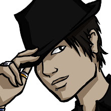
Personally, I love it. It's a good combination of "high class frontier lady" and "creepy alien". I'm worried that the top-down camera view will make it harder to portray the characters as well as these sketches have, so I'm hoping to be able to use the sketches between levels as part of the narration and story progression.
Sen 'Sholly' Holiday is currently a BFA student at the UoM: Twin Cities, and is an aspiring (video game) concept artist. When not drawing, Sholly can be found gaming, cooking delicious vegan food, and climbing just about anything.
HQ: www.resingular.com


So my first thought when I saw it was: oooh, nice colors! Then my second thought was: but the colors aren't very western. Maybe that's a good thing and maybe not. I'm not sure. In writing the music I started off trying to combine spacey, futuristic music with western music. Didn't work. So all of the music is western now.
ReplyDeleteSo maybe having the artwork more alien would help balance the theme. On the other hand, it could be confusing. I don't really know.
But it looks great!
Personally, I love it. It's a good combination of "high class frontier lady" and "creepy alien". I'm worried that the top-down camera view will make it harder to portray the characters as well as these sketches have, so I'm hoping to be able to use the sketches between levels as part of the narration and story progression.
ReplyDeleteYeah, the overall design is right on. I'm very glad we'll have the cut scenes.
ReplyDelete